
Responsive ux/ ui design
Create a responsive design system for a local grocery store featuring a map to help users find products.
As part of my final project for my Google UX Certification, I was tasked with creating responsive UX/ UI for desktop, tablet, and mobile sizes. In doing this, I named and branded the store, using skills from my background in graphic design to make this design the best that it could be.


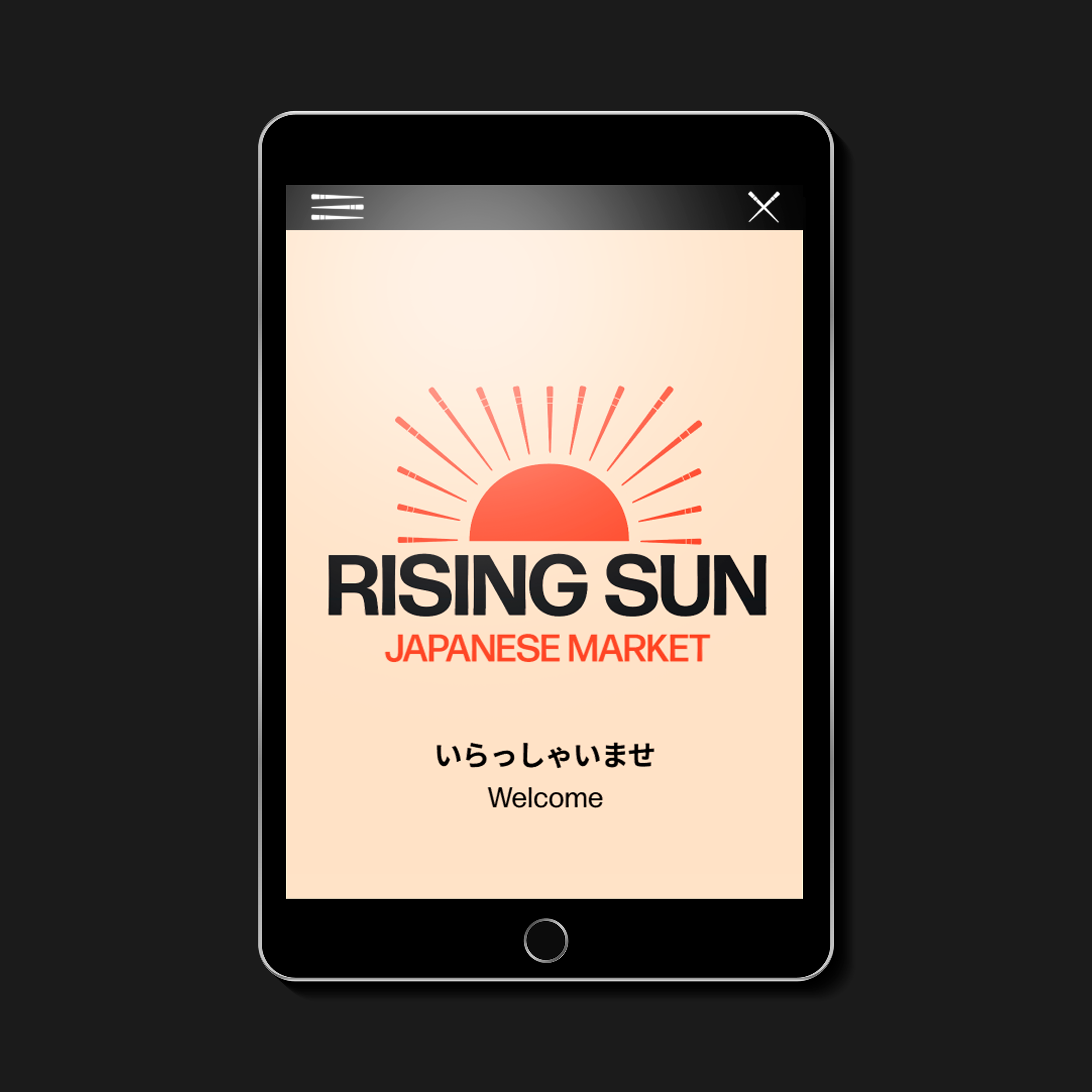
The Logo
The logo was inspired by the name of the store and the nickname of Japan, Land of the Rising Sun. I wanted the title and logo to feel quintessentially like Japan, but with a clever twist.
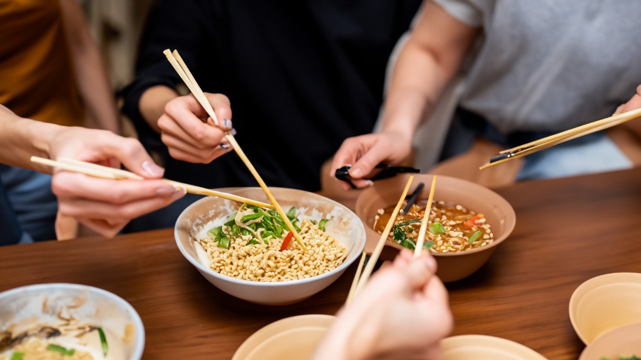
The logo displays a version of the Japanese flag, but with subtle illustrations of chopsticks in place of the sun’s rays to show the communal and ritual aspect of their dining culture. While designing this, I was imagining many hands with chopsticks reaching into one bowl of delicious food bought from my imaginary market.
Wireframes
Knowing that most users would be using this system to shop for groceries in real-time in the story, I started with a mobile-centered wireframe and planned to expand to bigger sizes from there.

From there, I moved to tablet-sized wireframes, understanding that these are also very portable and easy to use in-store.

Finally, I designed the desktop-sized wireframes, making sure to maintain a feature that allows the user to send their grocery list to their mobile device.

Key Takeaways
This was a great learning experience in UI Design where a map and cart are the most important features. A well-designed cart allows users to easily view, edit, and manage their selected items, ensuring a seamless and stress-free shopping process. Clear visuals, such as high-quality images of products, intuitive icons, and organized layouts, would help users quickly identify items and navigate the app efficiently. By prioritizing these elements, the design reduces friction, improves usability, and creates a more enjoyable and efficient shopping experience for the user.
I also learned a lesson in designing for a new culture. I wanted to prioritize simplicity and clarity, reflecting Japan's preference for clean, functional interfaces. Paying attention to details like typography, where balance and aesthetics are vital, helped me appreciate how visual harmony impacts user experience. Additionally, I explored cultural nuances, such as the use of colors and symbols, to ensure the design resonated with local users. This project emphasized the value of user-centered design and adaptability when creating for an audience with unique cultural expectations.